Add some color to your Powerpoint presentation
Make your Powerpoint presentation pop with color
Color theory for powerpoint presentation
The right color combinations can make your Powerpoint presentation stand out and hold your audience’s attention. Color theory is a complicated topic but if you can understand the basics you will be well on your way to creating colorful but balanced presentations. Start off by understanding some basic color theory and certain design rules.
Color theory for powerpoint presentation
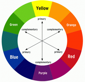
 The color wheel is a quick visual guide to understand the relationship between color. The wheel contains 12 hues separated into three distinct groups:
- Primary colors: red, blue, and yellow. All other colors can be derived from these three colors.
- Secondary colors: green, violet, and orange. These are created by combining the primary colors.
- Tertiary colors: red-orange, red-violet, blue-violet, blue-green, yellow-orange, and yellow-green. These are made combing the first six colors.
Complementary colors
 Colors opposite to one another are known as complements. Because they contrast each other, they are used to create a dynamic effect. When placed next to each other, they create the strongest contrast and reinforce each other. The traditional combination has always been: red–green/ yellow–violet/ blue–orange
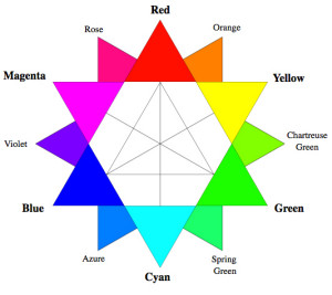
However on a computer screen the RGB color model is used and since its primary colors are actually red, green and blue the complimentary scale is red-cyan/ green-magenta / blue-yellow.
Analogous Colors
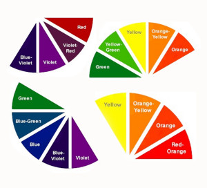
 Colors directly next to each other on the color wheel are called analogous. For example: Yellow, yellow-orange, and orange is a set of analogous colors. There is usually one primary, secondary and tertiary hues.
These combinations are most often seen in nature and creates a soothing, rich and monochromatic look. It’s best to use warm or cool colours in this scheme and be aware it does lack contrast.
Design rules for using color
- Know your audience when choosing your colors.
- You want your text to be easy to read and avoid eye fatigue. Go for a high-contrast combo like white and black or dark purple and light yellow.
- Less is more. Don’t go overboard and cram too much color into your presentation. Stick to 2 colors for the the text and 2 or 3 for illustrations.
- Stick with your brand. Use the colors from our logo or website to look more professional.
- Choose dominant colors from your graphics or photos to create a sense of balance and consistency with the overall presentation.
- Customise Powerpoint theme colors in a presentation template for easy access.
- Limit using red and green in case any audience members are color blind.
- Use bold to highlight text rather than different colors.
- Just choose one color for titles and one color for the body.
Background tips
- Try using texture as a background instead of color.
- Use one background color with 2 to 3 colors for text.
- Analogous schemes work best for background color.
- Contrast your text using a complementary text color.
Helpful tools
 Create a color wheel using some of the helpful websites out there suchs as Kuler.com or ColorLovers.com
Final words of advice: Always test your presentation on the projector; often color combinations look different on the big screen. You want your presentation to look its best.


Leave a Reply